Multiple columns with CSS
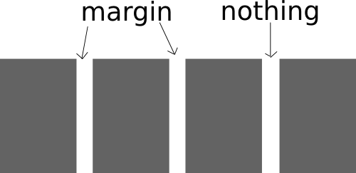
A setup I like for multiple column layout is to float each column to the left and use margin-right to create space between the columns. And then set margin right on the last two to zero and float the last one to the right. This technique leaves an area of absolutely nothing (not even margin or padding) between the two last columns so it takes more than a minor calculation error to make your layout fall apart. The same code can also be used for multi column grids, f.ex. displaying 12 products in a 4*3 grid.

The CSS code needed for this is conceptually as follows.
Continue reading